UX
Traackr
Lead UX Designer
Photoshop, Invision
I worked at Traackr for a year and a half as its Lead UX Designer. During my time there, I designed many new features, including a new search overhaul, analytics including adding an influencer relationship funnel, redesigning the platform to be more consistent and clean, and created a styleguide and component library for the developers and future designers to use.
At Traackr, as well as adding new features, we redesigned many of our old features and added on new functionality. I worked closely with the CXO to redesign our search page, give the visual stream a facelift, redo our list of influencers and our influencer profile pages, and update our analytics with new and improved graphs. We switched from a bold red to a softer, more muted red and used it more consistently throughout the site.
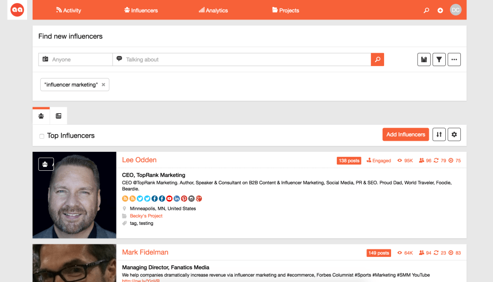
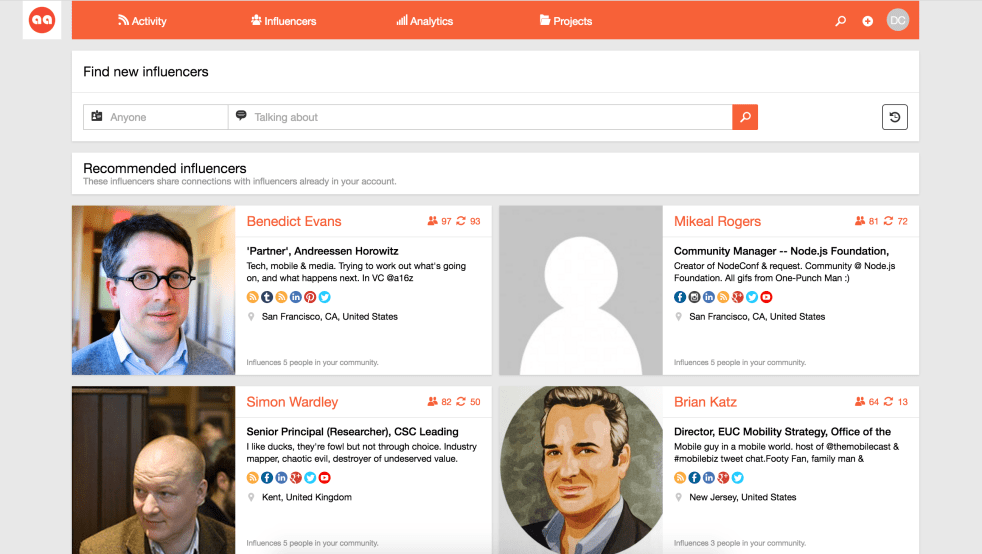
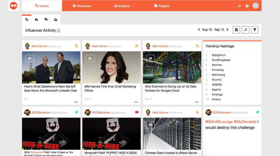
The search results page was one of the most rewarding redesigns I did at Traackr. Our old page was hard to use and cluttered, and required users to have to search themselves to find new influencers. We wanted to provide a way that we could include recommended influencers for your account within the search page or have the option of searching if you want. The paradigm of moving recommended influencers into the zero state of search was a powerful and helpful change for our users. During the design phase, I spent a lot of time making all the padding, colors, and styles consistent.
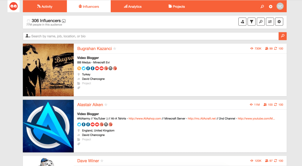
As part of the new design for our influencer search/recommended influencers, I took some time to clean up the way the lists of influencers appear on the platform. I removed any extraneous information and showed only the information that the user needs to know. I cleaned up the meta information, like influencer owner, the projects that the influencer was included in, and the location of the influencer, focusing heavily on consistency, padding, and cleanliness. I also made all the influencer rows the same height based off the height of their avatar, leading to greater consistency and easy reading and skimming.
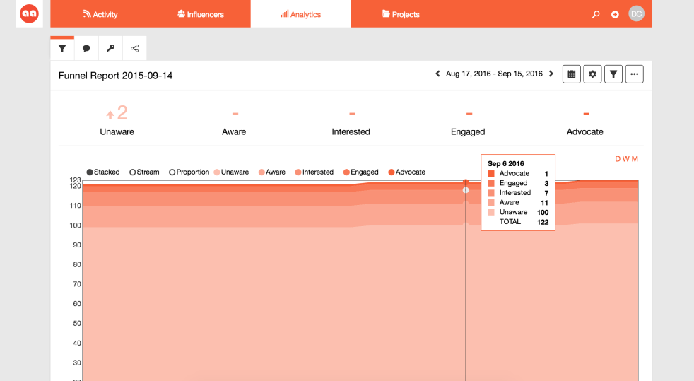
I took some time to revamp our graphs in analytics. Our old graphs were clunky and had very limited functionality – only the ability to hover over a point. The new graphs allowed for stacked, stream, or proportion graphs, and were much cleaner to match the update designs elsewhere.
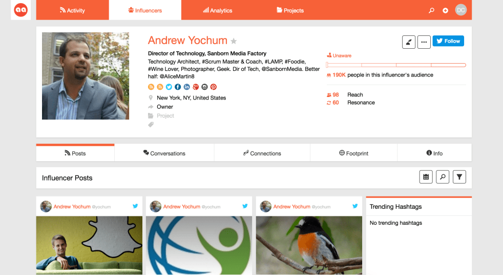
The influencer profile pages got a facelift as well. The biggest design challenge around this was consistency with the list of influencers as well as showing a large amount of information and data, without overwhelming.
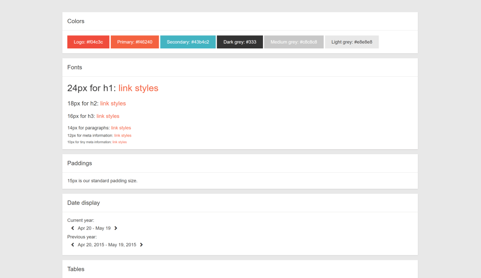
As part of the redesign efforts, I created an entire styleguide for the addition of new functionality, for the sake of consistent design as well as CSS. The dev team felt hesitant about the current state of the CSS, which had at one point tried to be componentized but never completed, resulting in mountains of duplicate CSS, lack of clarity for how to use each style, and plenty of bad practices, such as use of !important and inline CSS. A framework was sorely needed – unfortunately, the state of the HTML was written without a framework in mind and fairly inconsistent, so simply loading in a CSS framework would have been extremely time-consuming. We needed a custom framework.