UX // Branding
Takeoff Technologies
Lead UX Designer
Figma, Sketch
Takeoff provides eGrocery solutions to grocery partners via the use of micro fulfillment centers (MFCs), which can be thought of as similar to industrial sized vending machines. After product is placed inside the machine via a method called Decanting, the product can be fetched far more quickly than cumbersome in-store methods like Instacart uses. This allows fast eGrocery pickup and delivery, clean and uncluttered grocery floors, and separate operations to keep eGrocery running smoothly.
When I was brought onto the decanting project, the existing Decanting software was cumbersome, complicated, and not user-friendly. I worked in a team with one product manager and two developers to create a much more usable, efficient, and feature-rich system that would allow for future tracking and enhancements.

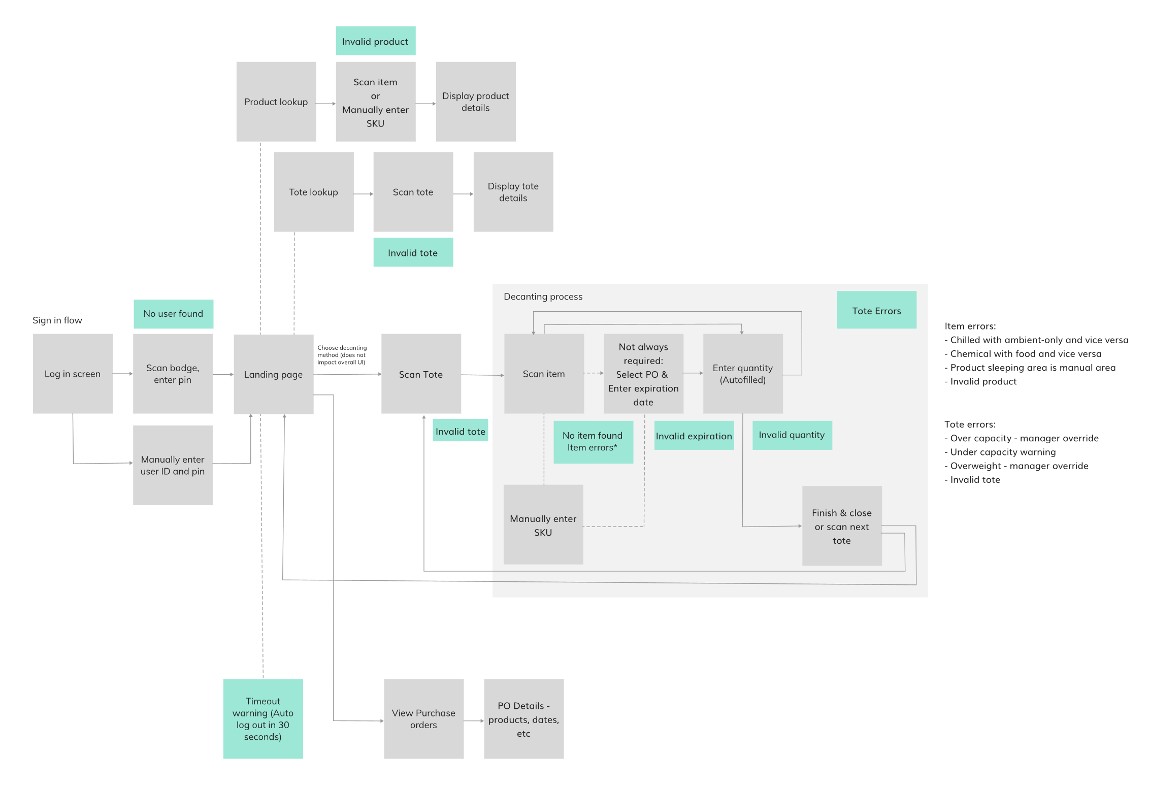
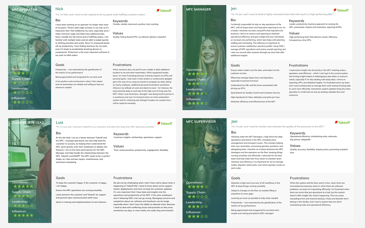
At the start of the project, the product manager and I got to work conducting user interviews and observations on the current users of the system, which we compiled into personas. In addition, we walked through several iterations of user flows and scenarios, as well as outlining the features (both present and future) we would need the decanting system to support.
The old decanting system threw the user into a screen with all the options listed, with no indication as to what order to go through the process. Users would guess and scan the products or totes out of order and immediately be hit with an error message that they could not deduce. We worked to create a more wizard-like process that walked the user through the appropriate sequential steps to add products into the MFC.
In addition, the decanting workstations at the MFC were cluttered with keyboards and mice, despite the monitors being touchscreens. The grocery operators were more familiar with touchscreens because of the existing point-of-sale systems, and the peripherals took up valuable space that was needed for handling the grocery products. I moved the system completely to a touch-based interface designed for the exact resolutions of the monitors onsite.
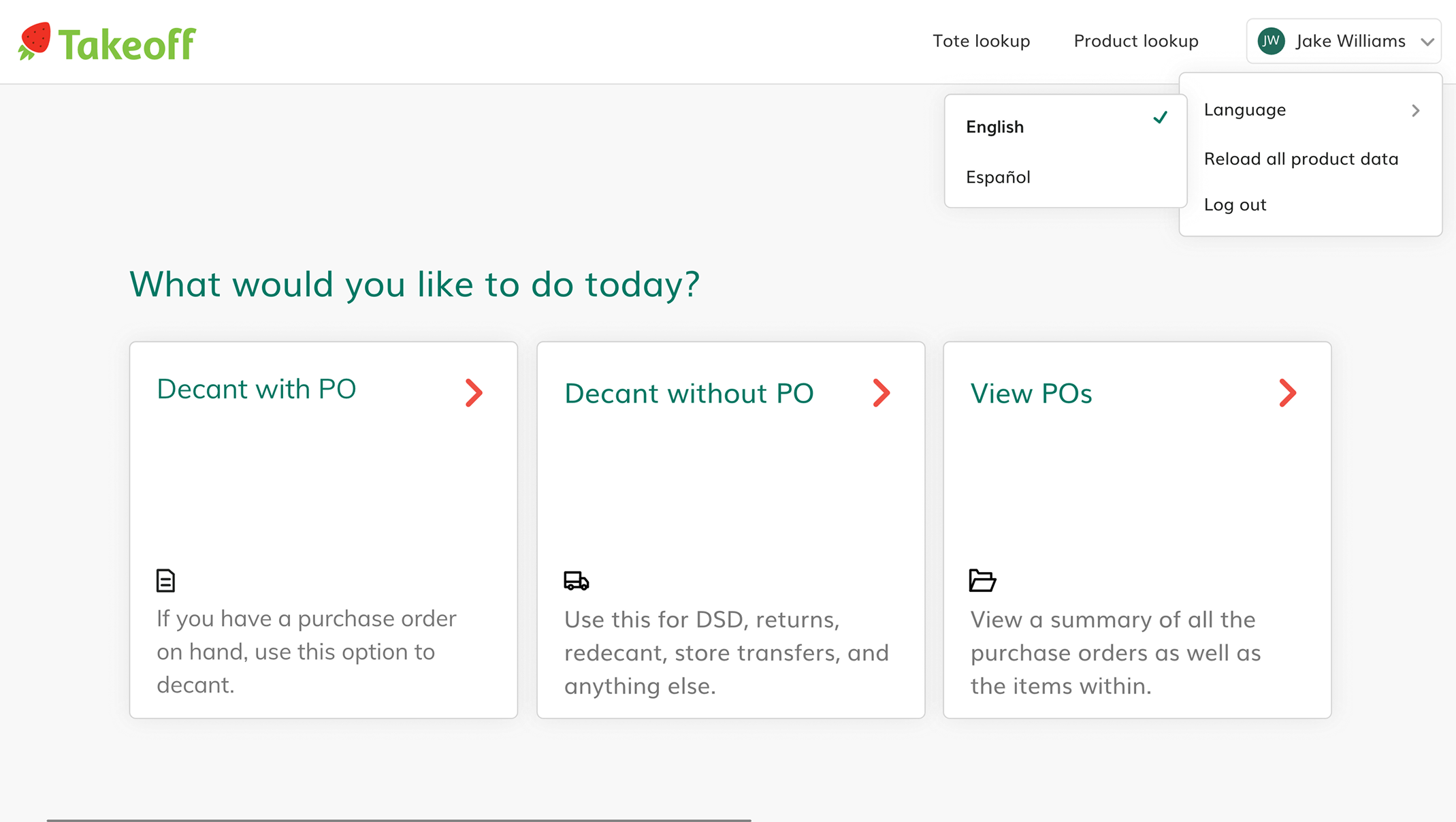
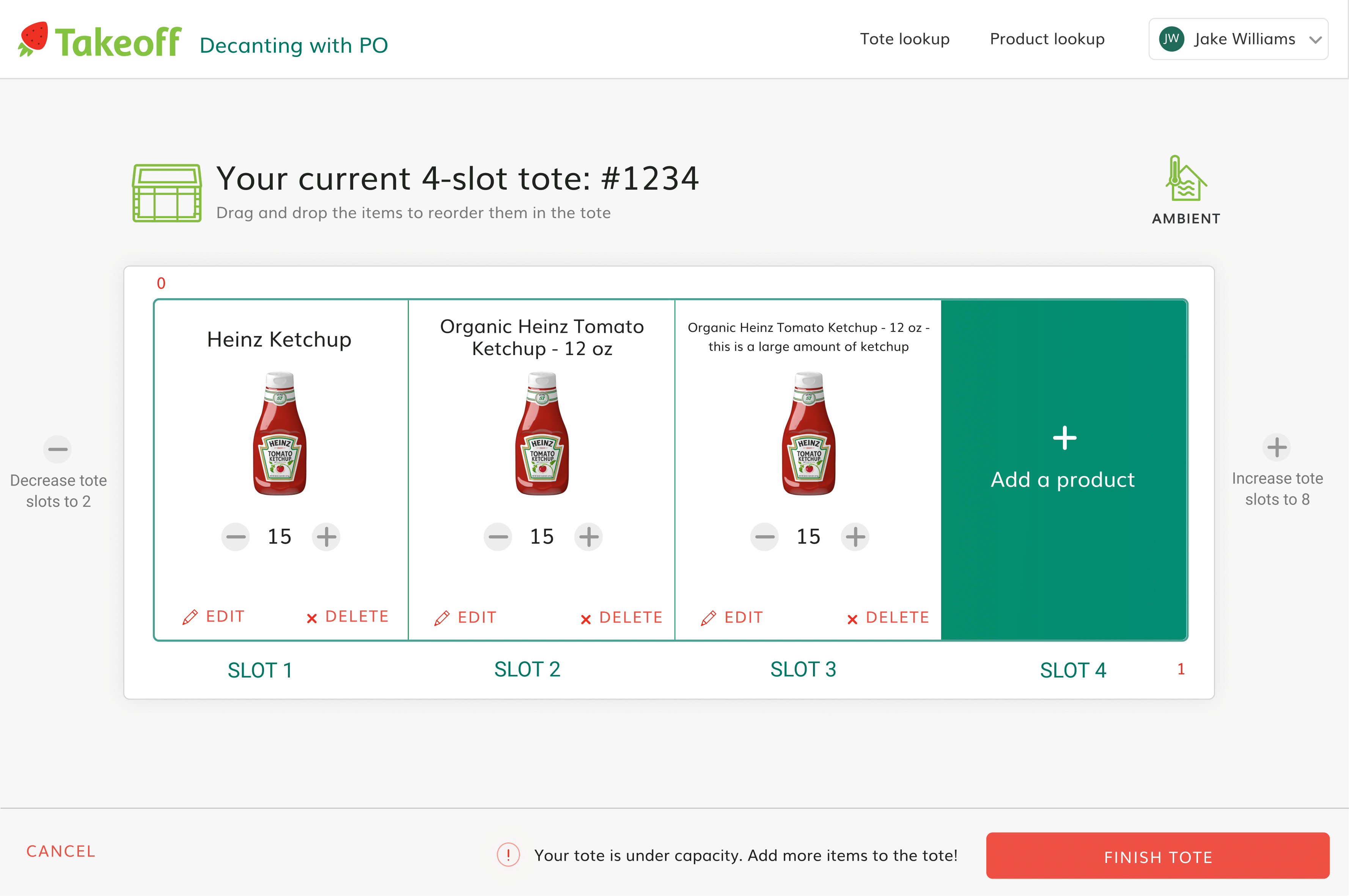
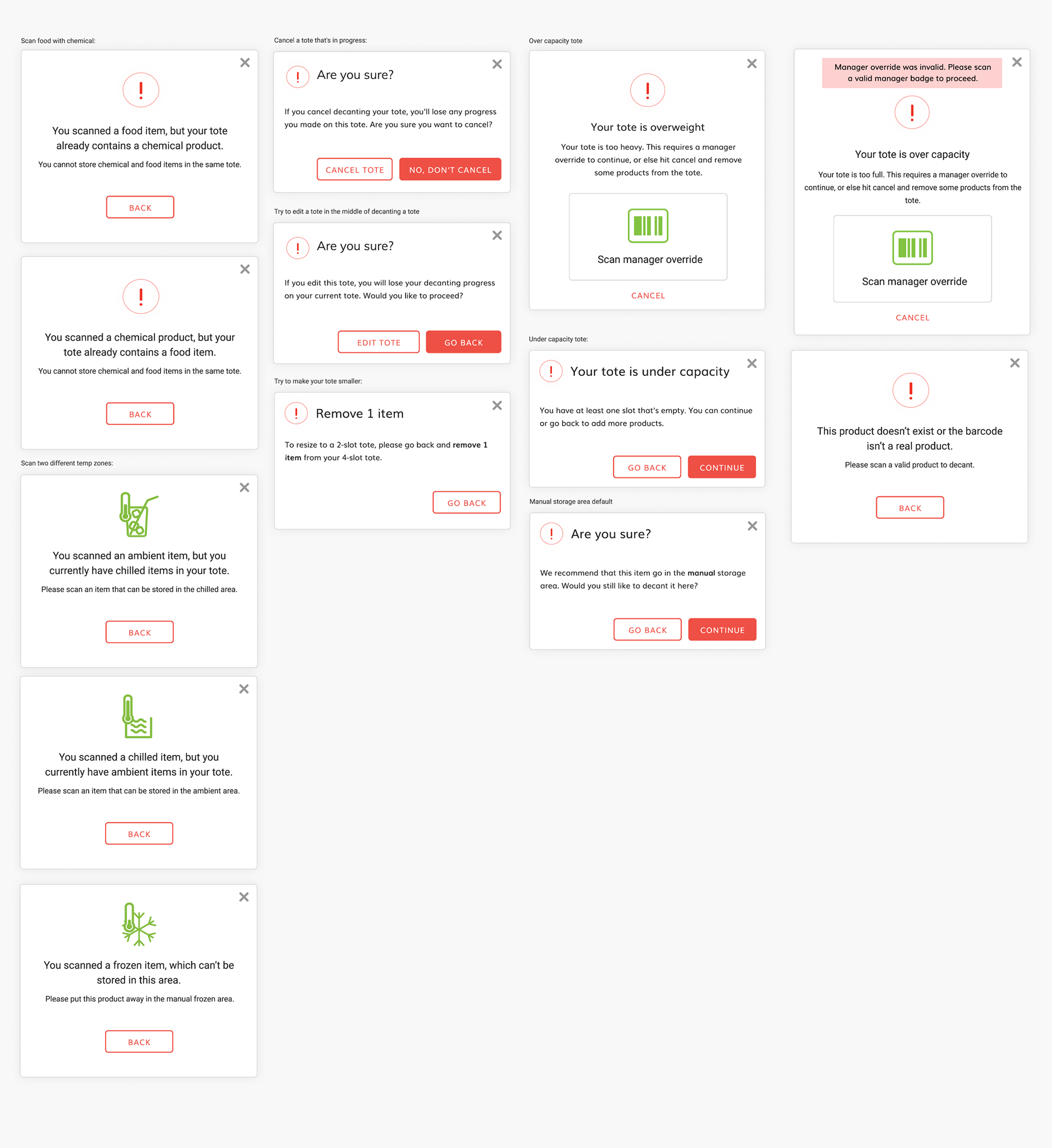
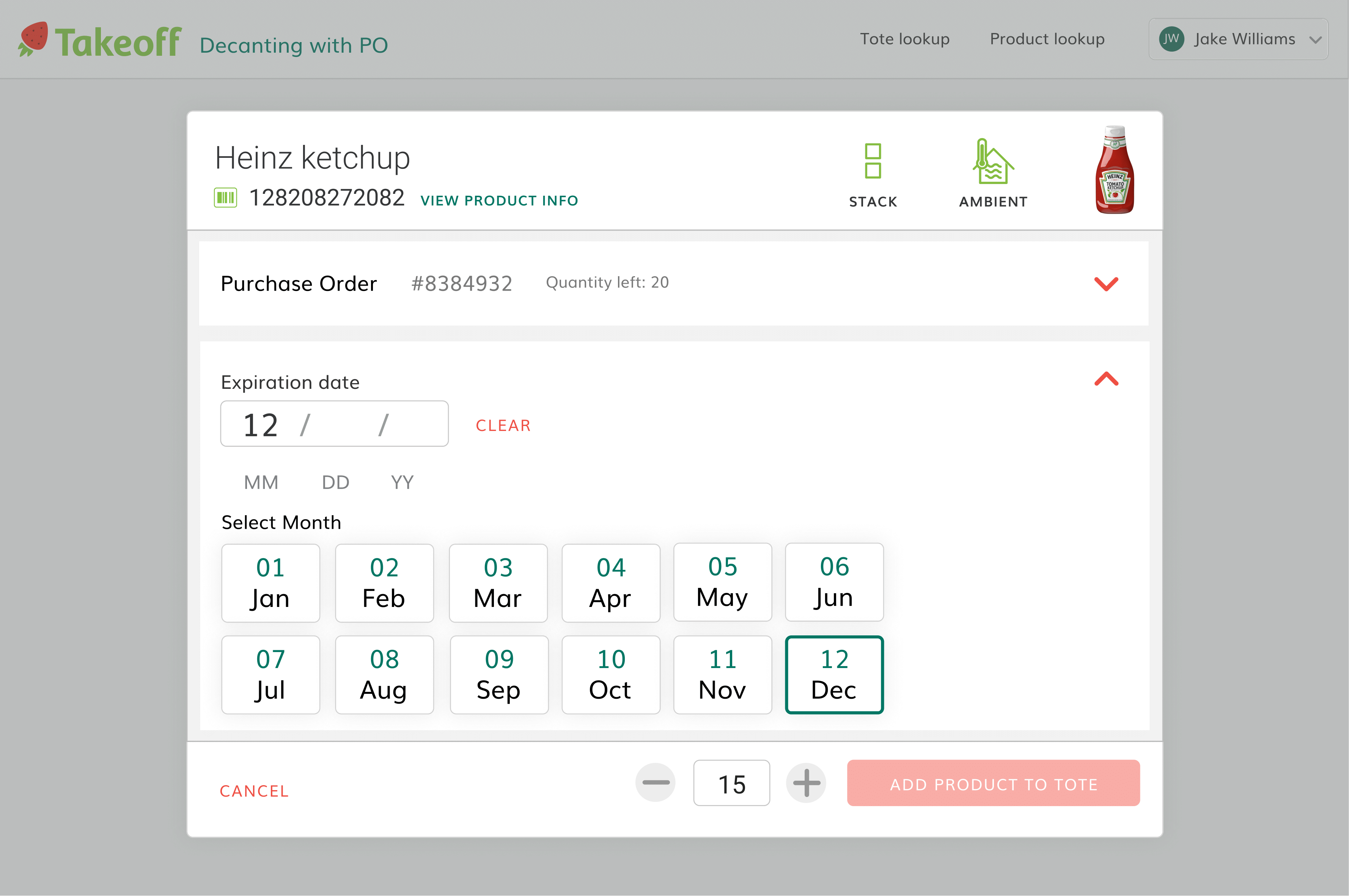
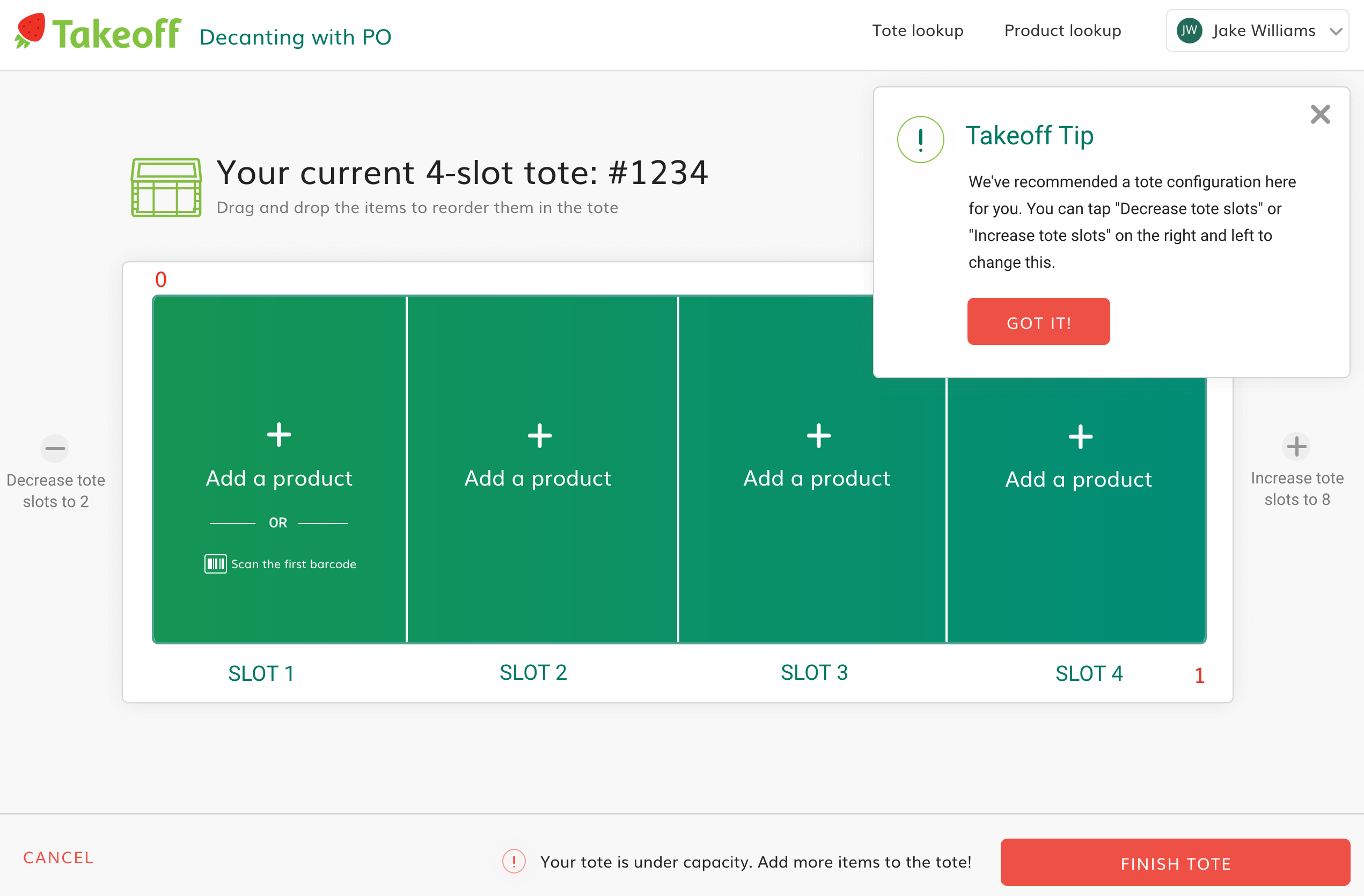
We also took into account various edge-cases that the user may run into when decanting products such as size or count differences or expiration date problems. We also made it as simple as possible for people to reorganize their tote on the screen in case they put product in a different slot than instructed. It's much easier to drag and drop a slot on a touchscreen than it is to move 40 bottles of Advil!
Throughout the project, we tried to anticipate as much as possible from the products, totes, and purchase orders themselves. Based on the anticipated inventory coming through the store each week, we could inform the user to make the system as efficient as possible. Fewer taps and steps means faster decanting. Our goal was to be as simple and transparent as we could be so as to reduce training time and mistakes.
