UX // Coding
Clara Health
Head of Design
Figma, Photoshop, Illustrator
The Clara app encompasses multiple projects over my year-long tenure at Clara. It included numerous features such as initial app design, filtering, information architecture, the onboarding experience, and profiles. As the sole designer at Clara, I was responsible for both product management work and UI/UX design. Due to my redesign, we significantly increased signups on our platform and raised over $11 million in Series A funding.
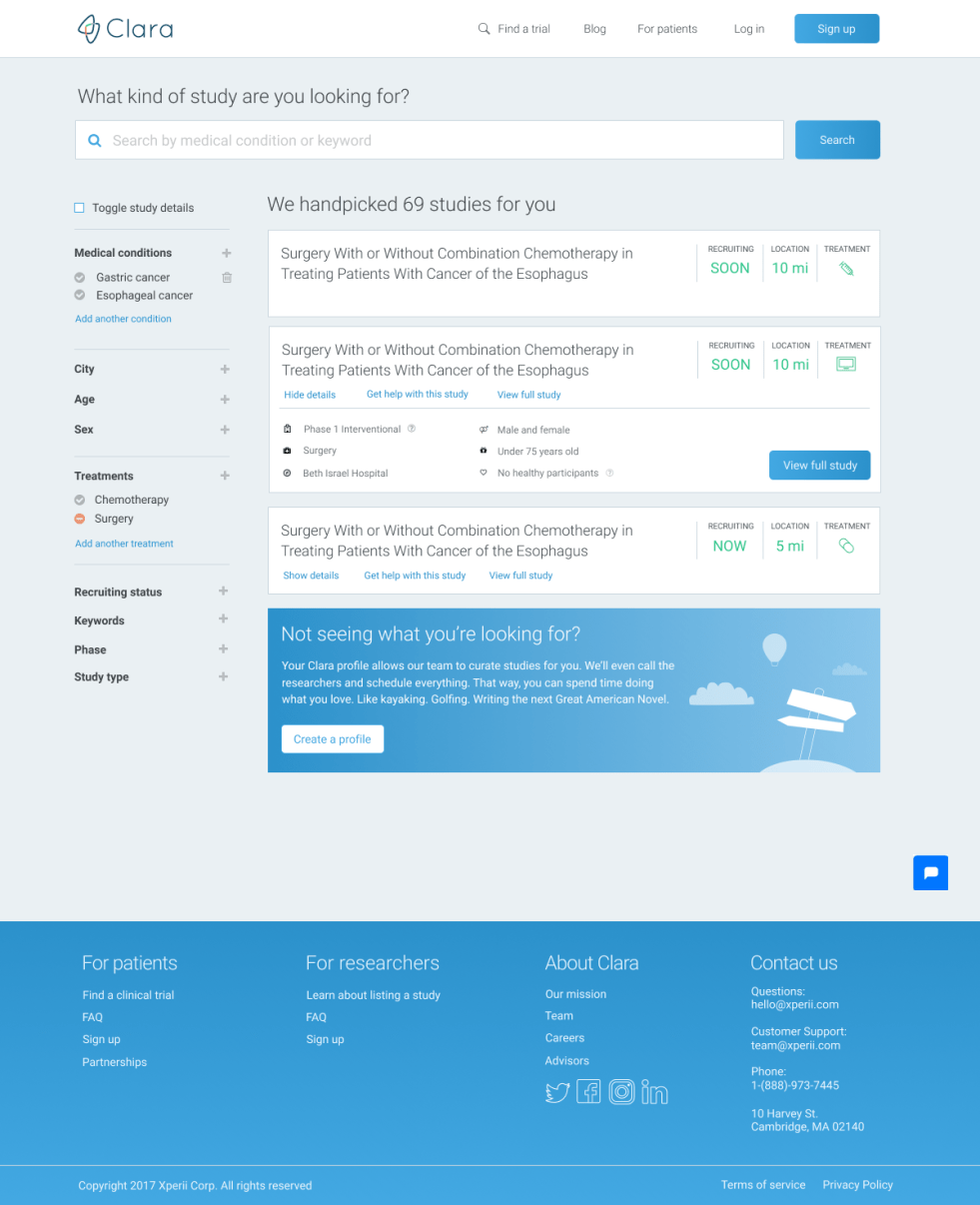
I designed the Clara search page with a primary focus on filtering capabilities and precise search results. One of my most important goals to achieve with this design was to refactor backend data such that it was congruent with user-facing filters. We needed to ensure that there would be no internal inconsistencies between study data and filters because certain phases and study types were incompatible. We did not want to allow users to select these mismatched filters, which would result in a frustrating user experience. As part of my research on the project, I discovered that users did not know what specific clinical trial jargon meant, such as phase or type.
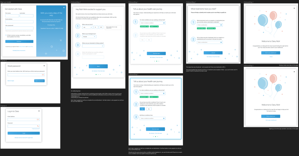
Before even embarking on redesigning the filters, I designed a new signup flow that featured a much more user-friendly onboarding process to return search results based on their medical profile. This way, most users wouldn't even need to touch any complicated filters at all.
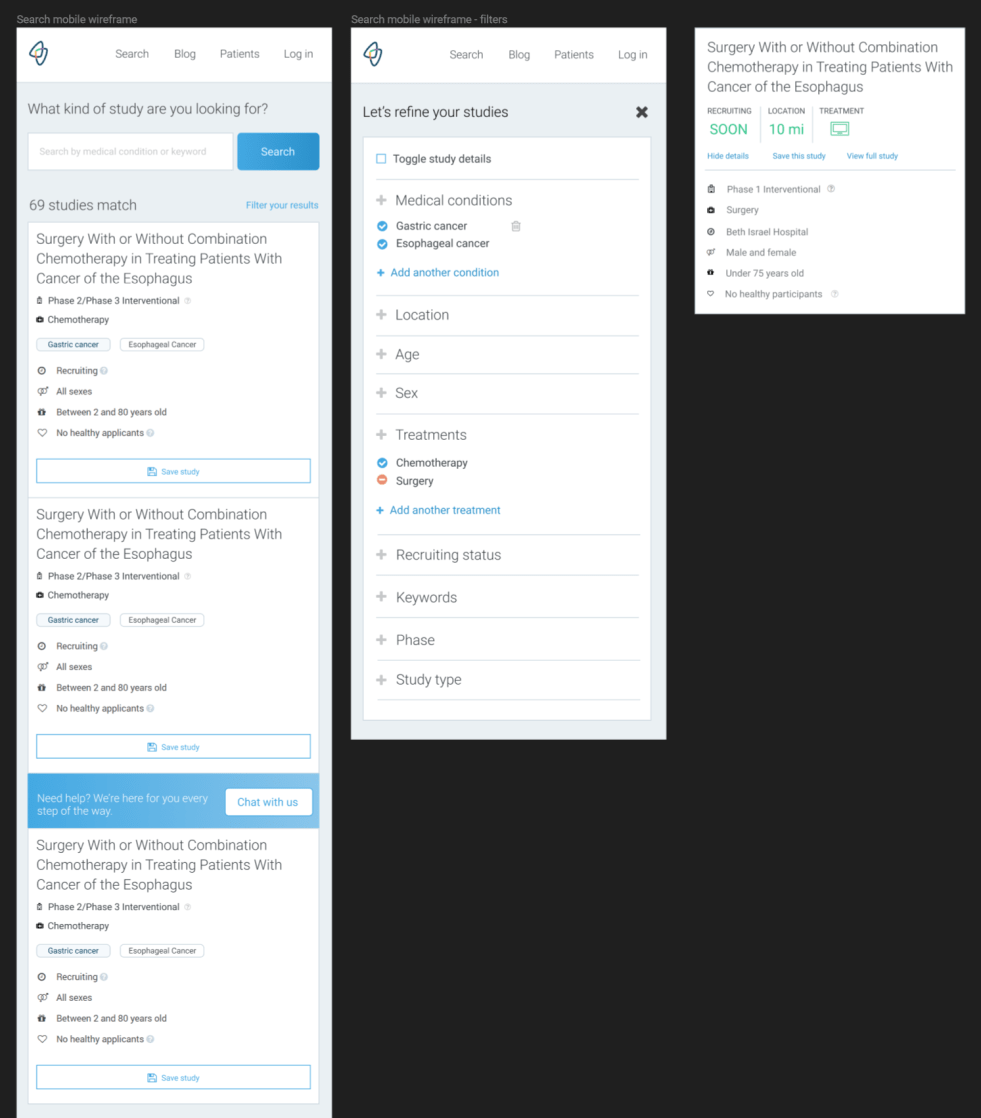
Below, I opted to move the filters into a full-screen menu for responsive mobile to keep the focus in one place and avoid bugs. The left screen is an older style of study listings, and the rightmost screen is the new style.
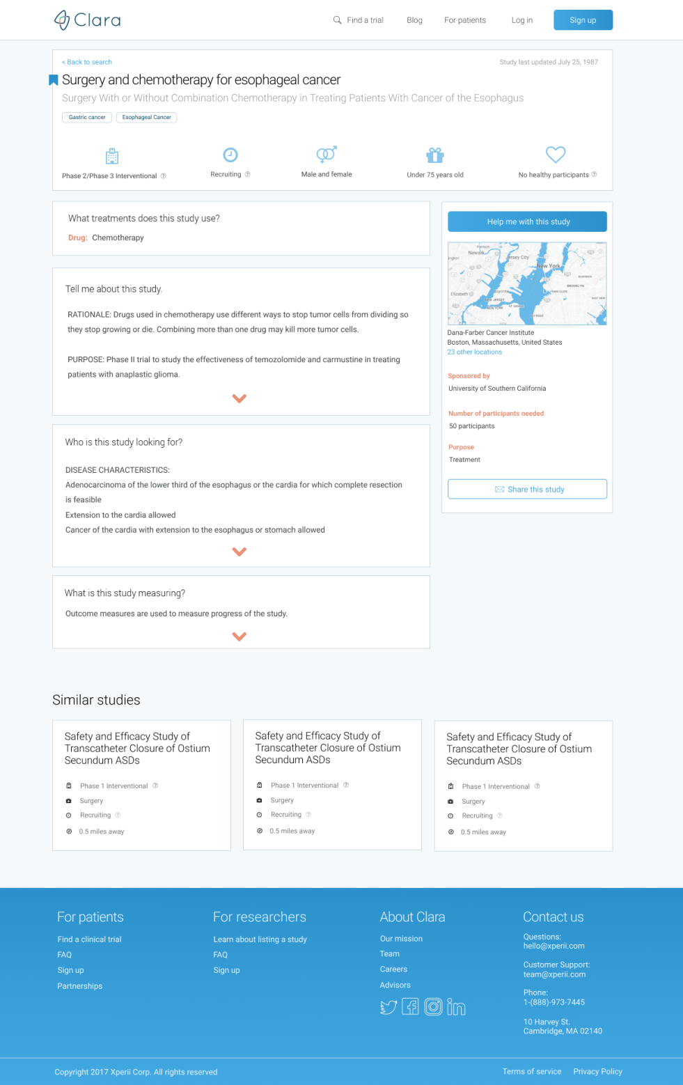
When I first designed the study details page, I found that the primary challenge was to display study information clearly. The clinical trial descriptions as written by researchers were filled with jargony, scientific, and complicated words that most people would not understand. Part of the reason why it was so unreadable is that the Institutional Review Board (IRB) requires specific language within the clinical trial context such as “human specimens” instead of “patients” or “participants.” As a designer, accessibility and readability are central tenets of usability, and I knew that our users would find this to be an obstacle.
To address this language limitation, we opted to describe the language surrounding the data in accessible terms. We also chose to rephrase the title and short description of our top 100 studies based on search in a way that was more patient-friendly.
I also designed features such as saving studies, mapping the clinical trial locations, and sharing studies with loved ones.
When I discovered that patients don't benefit from restrictive clinical trial language (such as phase or trial), I designed an onboarding process to walk users through steps to fill out a profile. By using a profile wizard, a user could select possible clinical trials without exposure to complicated language and still find relevant results. This approach allowed accurate clinical trial matching while enabling users to make informed choices.
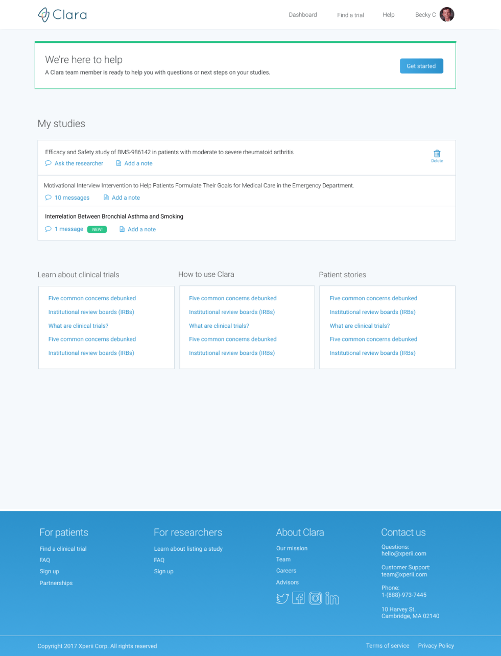
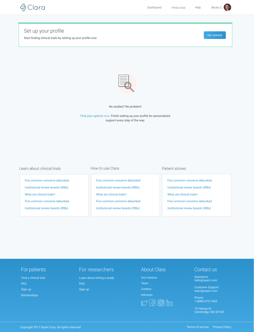
The patient’s dashboard included saved studies as well as messages and notes on their studies. If the researcher were not on Clara’s platform yet, the messaging system would relay directly to Clara.
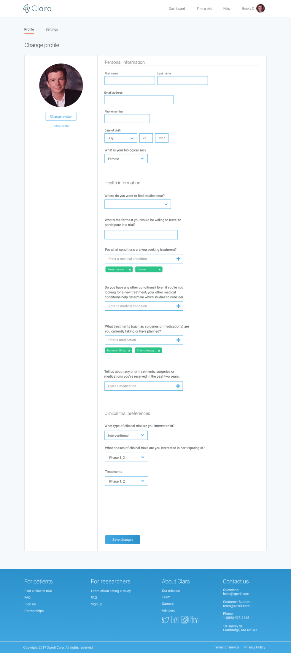
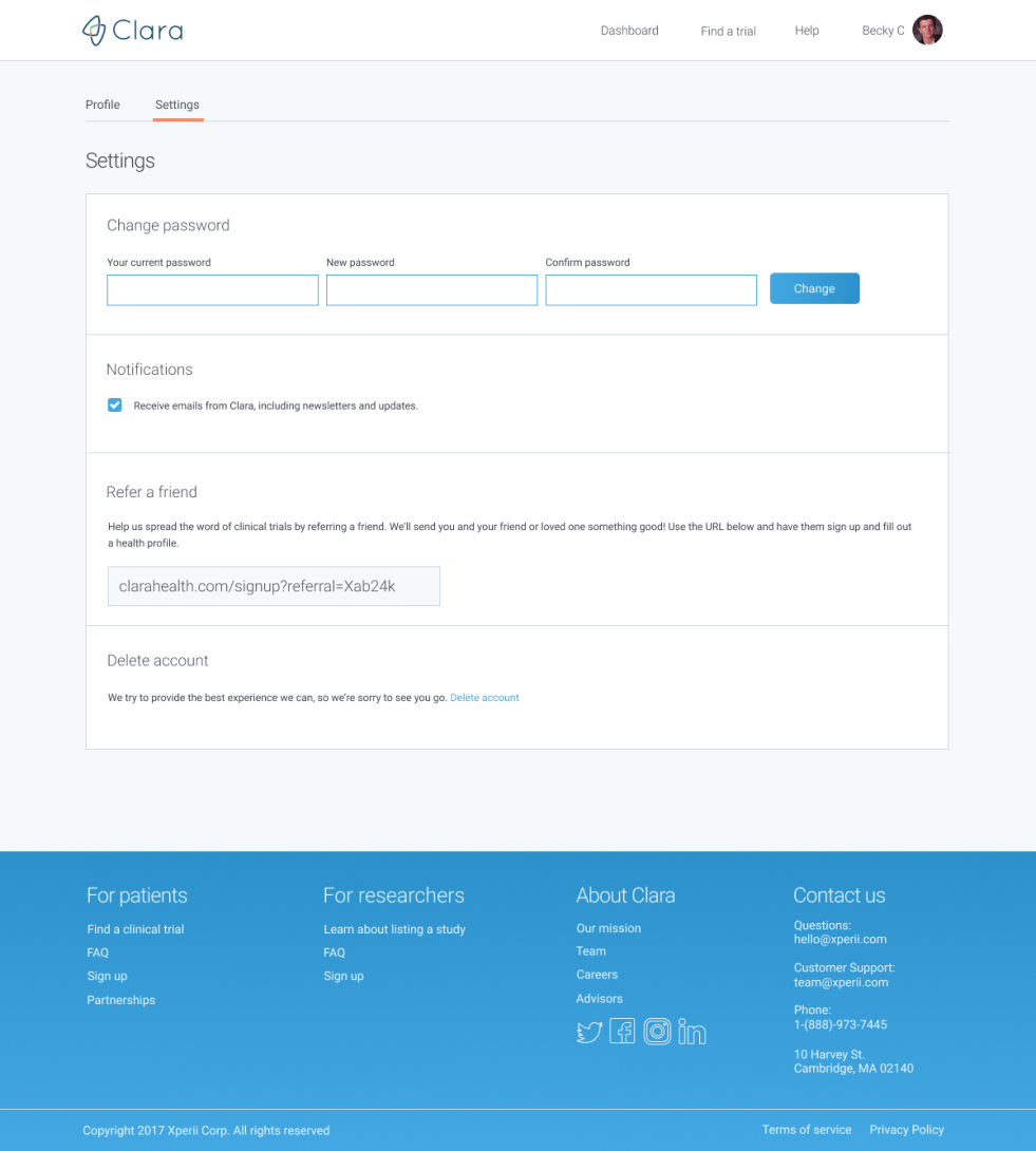
The patient profile reflected all their basic information as well as their medical onboarding information.
In addition, this is where I included Clara’s referral link. If another patient signed up with a referral link, then both people would receive an incentive. This was an excellent way to enhance the efficacy of Clara’s grassroots growth strategy.
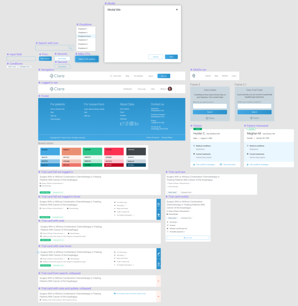
This is Clara’s component library, which ensured that all design elements were consistent within Figma and across Clara’s app.